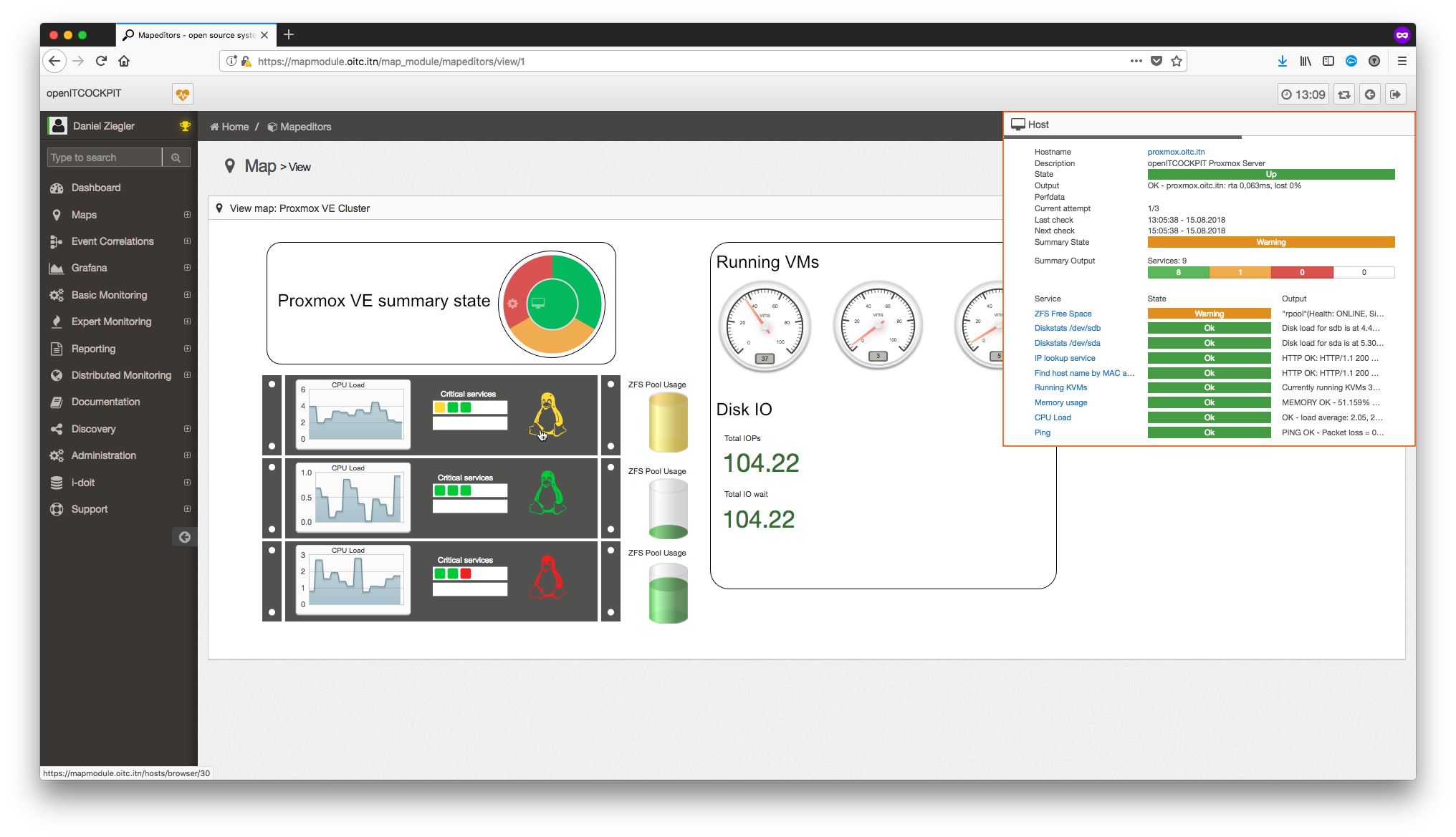
Preview: New Map Module for openITCOCKPIT 3.5
With openITCOCKPIT 3.5 we will release a completely rewritten version of the Map Module for openITCOCKPIT. This blog post will give you a quick overview of the changes that come with the new Map Module.
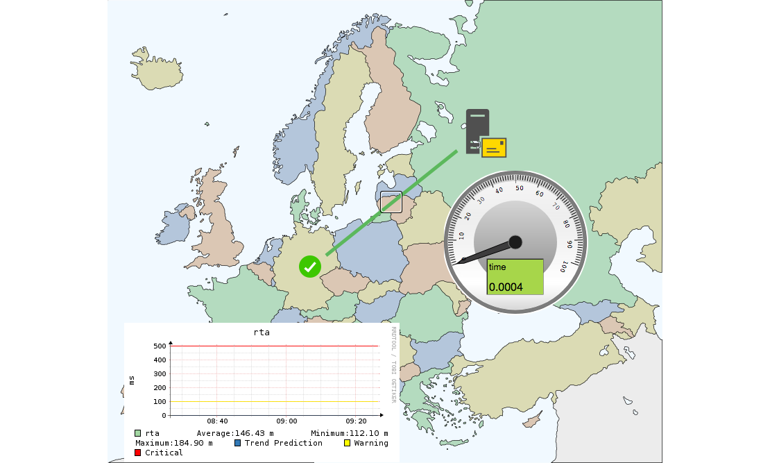
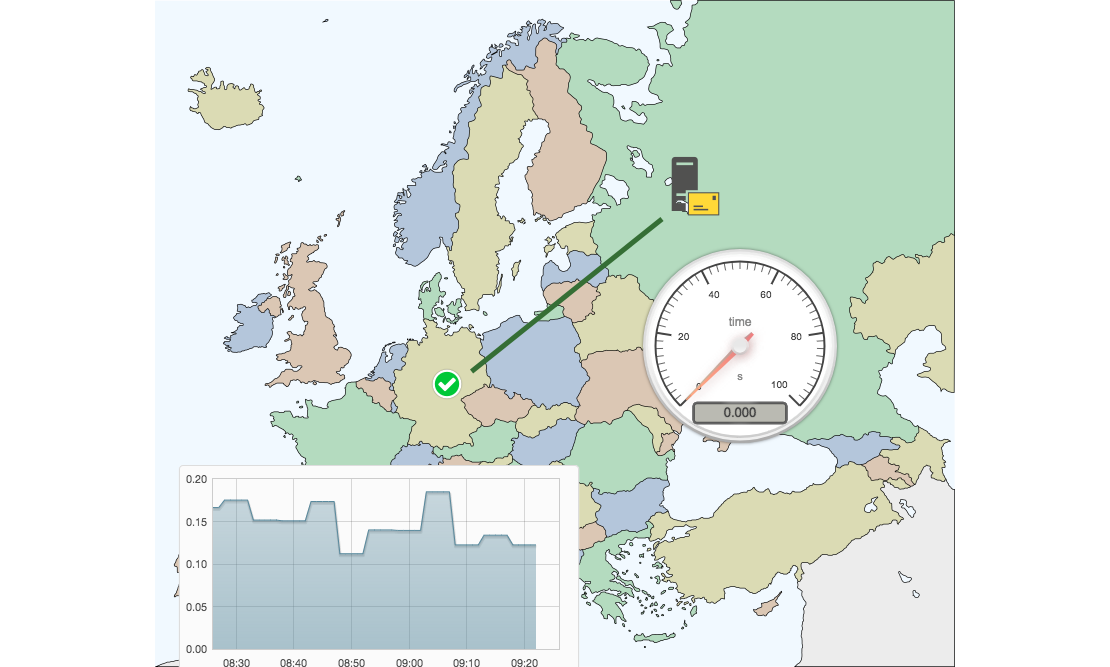
First of all we polished up the icons and gadgets.
New Gadgets
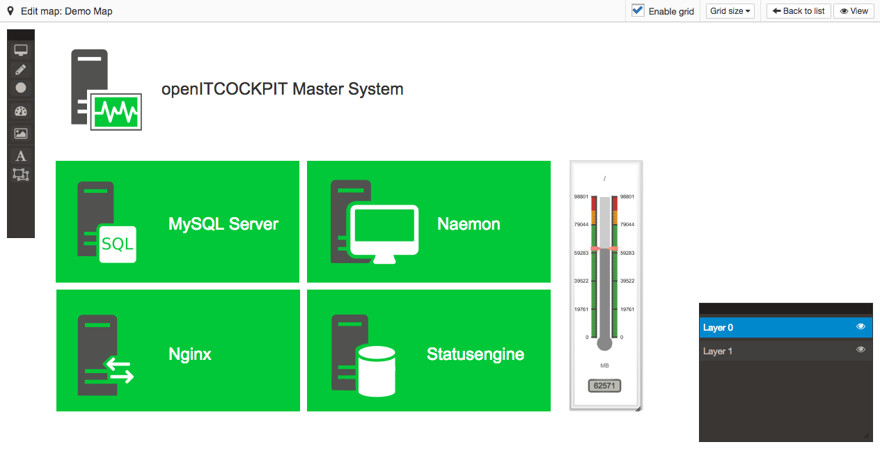
We replaced the Gauge and Graph Gadget completely. In addition we added a Linear gauge Gadget Which could be used to visualize temperature values for example.
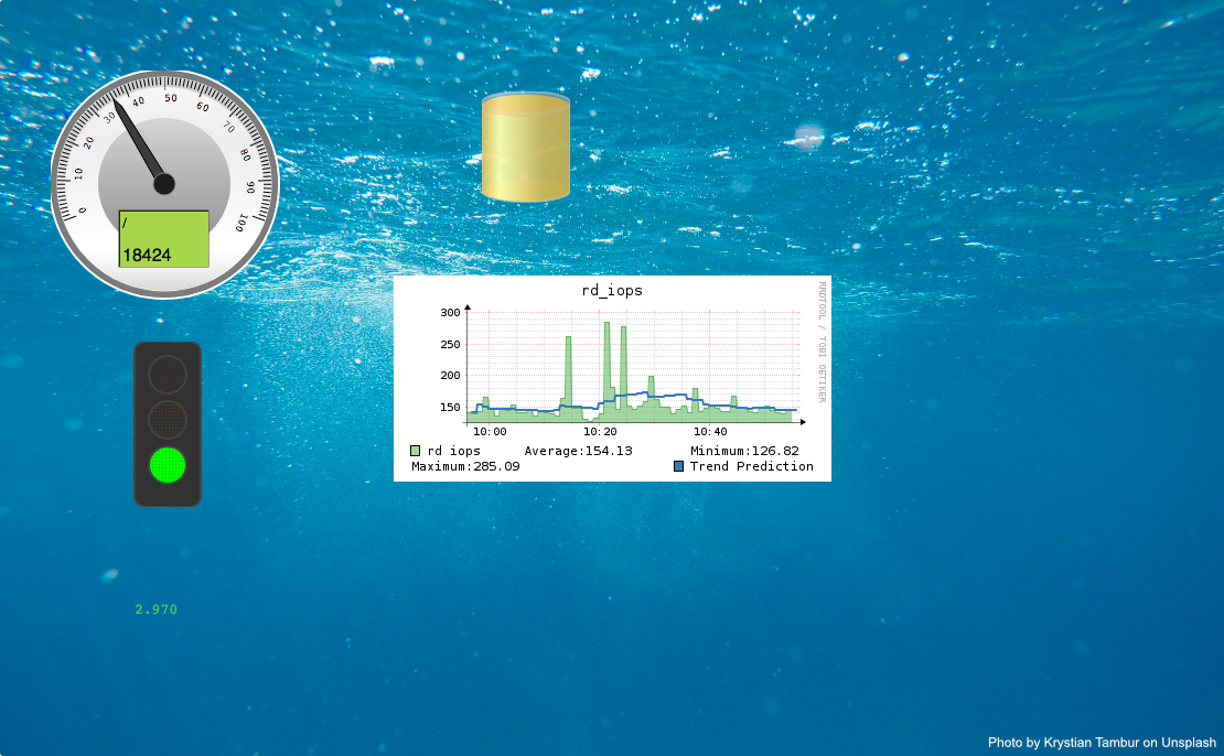
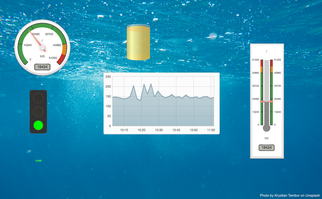
Resizable Gadgets
All Gadgets are now resizable. To resize a Gadget, drag the bottom right corner.
New Editor
The new map editor provides a toolbox where you can select the object type you want to create on the map.
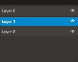
The layers box provides information about existing layers. More information about the layers can be found below.
The toolboxes can be moved if they block the view.
One of the biggest changes to the editor is that all objects are also displayed in edit mode with their current state. Gadgets also display current data. This can help you to create many beautiful maps.
You can also add a label to objects and all changes will be displayed in real time:
Layers
The concept of layers also exists in the previous version of the Map Module, but it was refactored from scratch to become more user friendly.
Layers are useful if you want to stack objects or stateless icons.
The selected layer in the layer box is the current used default layer. Every object you will create, will be automatically created on the selected layer.
You can switch the current default layer, by clicking on the layer name. To hide a layer, click on the Eye icon.
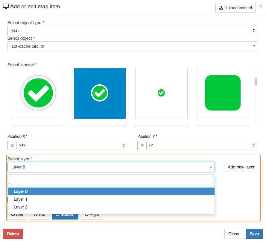
You can also select the layer while creating or editing an object.
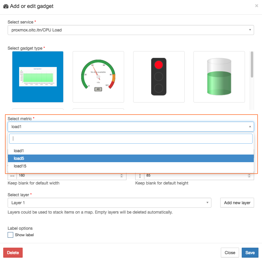
Selectable metrics
It is now possible to select the metric, which should be used for the Gadget:
New status overview in View mode
If you hover over an icon in the View mode the new status overview overlay will stay open for 5 seconds. If you hover over the status overlay it will stay open until you click on it or move the mouse away.
New Summary State icon
The Summary State icon was made for big screens like a TV. The icon is splitted into two circles. The inner circle will represent current host states.
The outer circle will show all service states. It should be used as an general overview, to get an easy to visual image about current issues.
As already mentioned, the icon was designed for TV screens. For this reason the icon will only show that a host or service is in an non ok state. The size of the colored areas is not linked to amount of hosts or services that are in a particular state.
Additionally, you can resize the summary state icon like a Gadget.
Color guidelines and refurbished icons
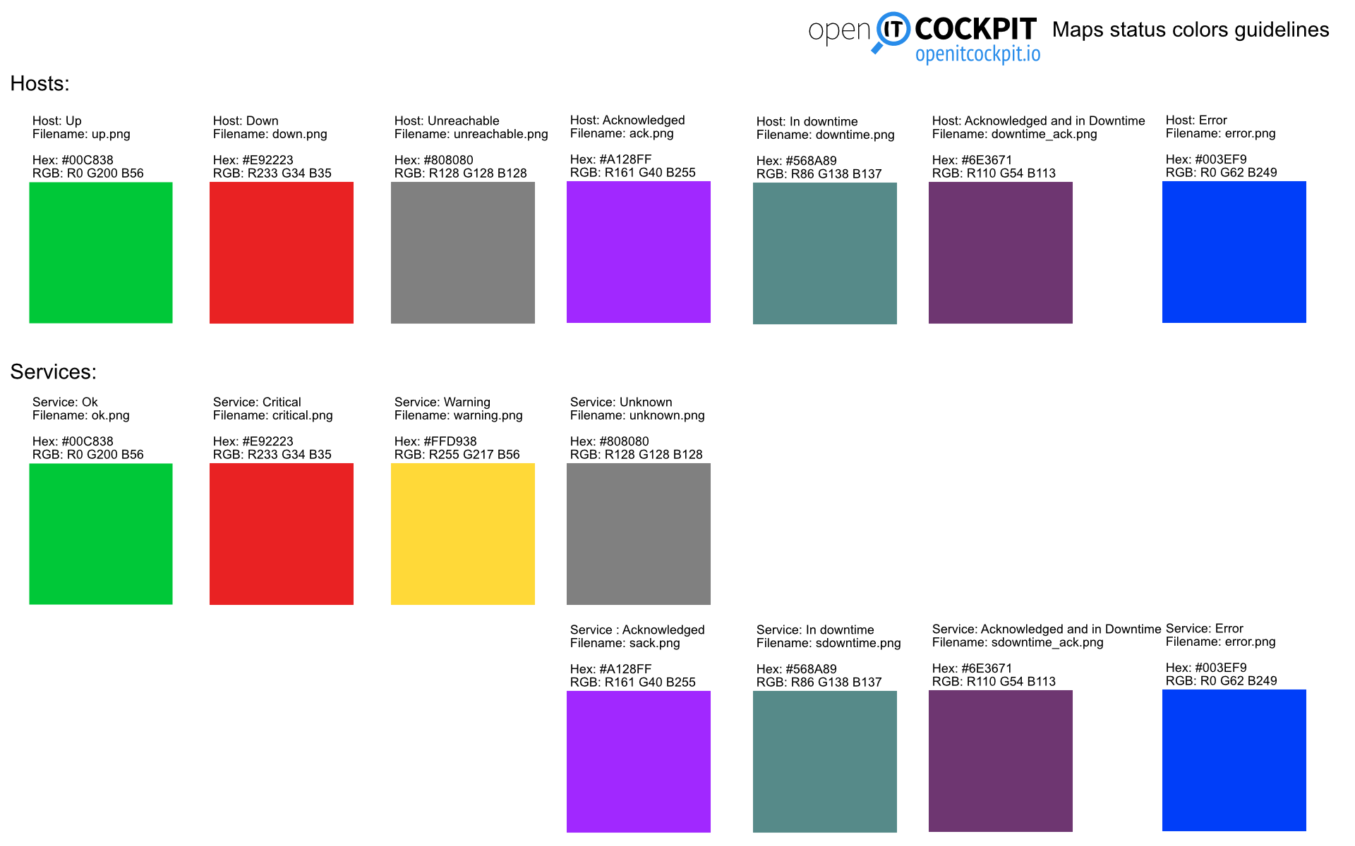
We defined some guidelines of which color should represent which status. This guidelines also include all required file names, so you can start to create your own icon sets.
Download as Map_Status_Colors_Guidelines.svg
We also updated all default icons to the new guidelines.
When will this be available?
The new Map Module will be part of openITCOCKPIT 3.5. Follow us on Twitter to to stay tuned for further updates.
